In the middle ages, sculpture was the primary religious art medium. Painting came much later, although many statues, both stone and wood, were richly adorned in paint to heighten the emotional appeal. Even when oil painting became widespread, the paintings were often begun with gray-toned underpaintings that attempted to capture the three-dimensionality of sculpture.
Grisaille is derived from the French word gris, meaning gray. It describes a method of monochrome painting that begins with a gray underpainting which establishes form and value as a basis for the work. Many works from the late Middle Ages and early Renaissance were executed in grisaille only.
When I traveled to Saxony in eastern Germany, I visited the centuries-old city of Naumburg to see the cathedral and the famous stone carvings of the medieval artist known as the Naumburg Meister. Carvings of the twelve cathedral founders, including Uta and Ekkehard, encircle the west choir, exhibiting a startling psychological realism seen nowhere else in 13th-century art. They look as if they might step down from their pedestals and speak to you, each with his or her own personality, each a completely realized human being. Famous German icons, they are frequently seen in art history texts.
Beneath ground level, as in many Gothic cathedrals, is an earlier structure, a magnificent crypt with stately Romanesque columns and arches. Disappointed by my underlit photos of the crypt, I was pleased to discover a book about the cathedral – Der Naumburger Dom, with text by Ernst Schubert and photos by Janos Stekovics. The wonderful photos by Mr. Stekovics were indispensable in my reconstructions of what I had seen on my visit.
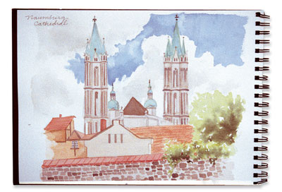
The cathedral inspired many sketches and journal entries.
The sculpture and the beautiful proportions and scale of all the elements impressed me the most, and the crypt was perhaps the most perfect of all the architectural features. I decided to make the crypt a large scale painting subject, and part of a planned series I hope to complete on the cathedral.
Planning the painting
I decided that a grisaille underpainting might best capture the power of form in the crypt of the Naumburg cathedral. Grisaille can be done in gray or neutral colors. The masonry in Naumburg is creamy stone, with golds predominating. I decided to create a warm grisaille, leaning more towards brown than blue, avoiding cool grays, which might combine later with the subsequent glazes of cream and gold to create a green.
Next I contemplated how to combine watercolor pigments for a grisaille that would remain undisturbed by subsequent glazes. Grays that I usually mix for other paintings with French Ultramarine Blue and Burnt Umber or Burnt Sienna consist of too many large particles of pigment and might have resulted in muddy color if overpainted. So I decided on pigments with a high degree of transparency and very little granularity. I substituted Phthalo Blue (red shade) for the French Ultramarine Blue, and Quinacridone Burnt Orange for the Burnt Sienna. I mixed these colors to establish all the hues I would employ. I also created a value scale, varying hue within the value range.
I decided to change the color considerably from the photograph. I wanted to convey a certain emotional reality that the more neutral and lifeless grays could not do. In spite of being a burial place for the cathedral bishops, the crypt was very much alive for me with the intentions of its medieval creators. It was a warm place, even holy, and filled with the dedication and love of those early stonemasons and artists. I decided that emphasizing the creaminess and golds was a way for me to convey these emotions.

Enlarging the photo
The two-page photo of the crypt by Janos Stekovics from Der Naumburger Dom, (used with permission of the publisher, Stekovics Verlag, Halle, Germany) captured the immensity of it, but I was most interested in the vaulting and columns, so I chose to paint only half of the photographed area.
I wanted an extremely precise rendering of the columns and arches and capital decorations. I knew that it would take hours of drawing preparation to insure proper perspective, but I really wanted to concentrate more on the painting and expressing my own interpretation of the subject through color choices and subtle wash handling.
I decided to take a shortcut and enlarge the photo (making an inexpensive black and white copy) at a copy center to save time. Normally, I use my own photos for this, but having received the permission of the publisher to use Janos Stekovics’ photo allowed me to do this without fear of copyright violations.
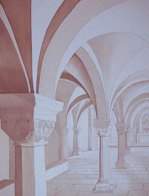
Placing a piece of transfer paper between the enlarged photo and my stretched watercolor paper, I drew only the major outside contours of the vaults, columns and floor stones on the photo, as well as the capital decorations. Those were transferred onto the watercolor paper. I ignore value and shading at this stage. What I transfer is simply a line drawing.
Laying the grisaille foundation
Paint preliminary values
I mixed a gray with Quinacridone Gold, Quinacridone Burnt Orange, Phthalo Blue (red shade), and Carbazole Violet. Using a light value of the gray mixture, I painted arches and columns, taking care to leave unpainted paper as the lightest lights. In some places I created a transitional zone between white paper and gray by dragging a damp flat brush along the edge of the wet gray wash.
Paint a second value
Using the same paints, I mixed a medium and a darker value of the gray hue and, painted a second and third value, once again creating transitional zones between the gray values by dragging the damp flat brush.
The grisaille foundation was now complete. I had created a very solid structure of forms with lights and darks which made me feel confident about the subsequent stages of my painting. In more direct painting methods, you’re never quite sure what your efforts will yield.
A misplaced brushstroke in a staining or dark-valued color can spoil a painting. But with the sturdy structure of the grisaille, I felt positive about going ahead with my glazing. I could begin with pale washes, because they would sit on top of the grisaille, which would make them appear darker. The pale washes could be wiped out if necessary to make color corrections. Once I was satisfied with the colors, I could incrementally add darker and more saturated colors.
Adding the element of color
Color glaze
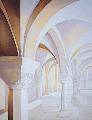
Beginning with Quinacridone Gold, I began to lay on thin glazes of color, some gradating into other colors, including Quinacridone Burnt Orange, Anthraquinoid Red, Carbazole Violet and Phthalo Blue (Red Shade). I thought it was important to choose a range of colors, even within a single small area. Without the range of hues, the painting remains somewhat lifeless. Values alone are not enough to make it interesting.
I started with the lightest color in the range and then dropped in the darker-valued hues while the wash was still damp. Before picking up the next color, I rinsed the brush well, blotted it on a towel, and used only the very tip of the brush to pick up the next color. I touch the damp area only with the tip of the brush and in this way avoid the risk of backruns, which happens when the brush is overloaded with water or wash.
The grisaille foundation kept this stage of the painting quite simple. It was really just a matter of laying pale color upon the underlying structure of the painting.
Darken color values
I painted over the darker-valued areas with purer hues with a fairly saturated brush, also gradating color within this darker-valued range.
I worked on one small section at a time. For instance, I worked on one column or one vaulted arch area. I wet the entire area of the section and then dropped in color, which allowed for gradations and varied hues. I used Quinacridone Burnt Orange in heavier concentration as it helped the dark areas maintain a warmth.
Final corrections
I corrected color on some of the columns and arches. I had left too much white paper in some of the arch areas so I wet them and dropped in more grays and violets. Within the three surface facets of the foreground column, there was too much of a rigid dark/medium/white value shift — it looked a little like Neapolitan ice cream! — so I darkened the values in the central and rightmost facets of the column shaft.
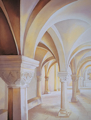
Starting with a grisaille underpainting and working area by area, and allowing these areas to dry made for a lengthy painting process — probably about eight hours in all. But it was far from tedious — working in washes is one of the most fun aspects of being a watercolorist. You lay a wash in one color and drop in a subtly altered hue for gradation of color and suddenly a too-literal rendering of a subject becomes art that has an emotional resonance. Remembering the work of the original stonemasons at the cathedral a millennium ago, I rarely feel that watercolor painting is hard work. I just imagine them working from their drawings with hammer and chisel, carving out an otherworldly beauty from the raw material of stone. As an artist, I feel privileged to be able to participate in this small way in their magnificent achievement.


