I have always been fascinated by people – their facial features, the variety of their expressions, and the light that shines in their eyes all enliven my inspiration. Making a portrait, in my opinion, is much more than searching for similarities to paint. It’s crucial to represent the subject’s soul, character and dreams. I carefully choose my subjects, selecting them from among thousands of photographs, and then I carefully observe them until something magically happens and the inspiration comes right to me.
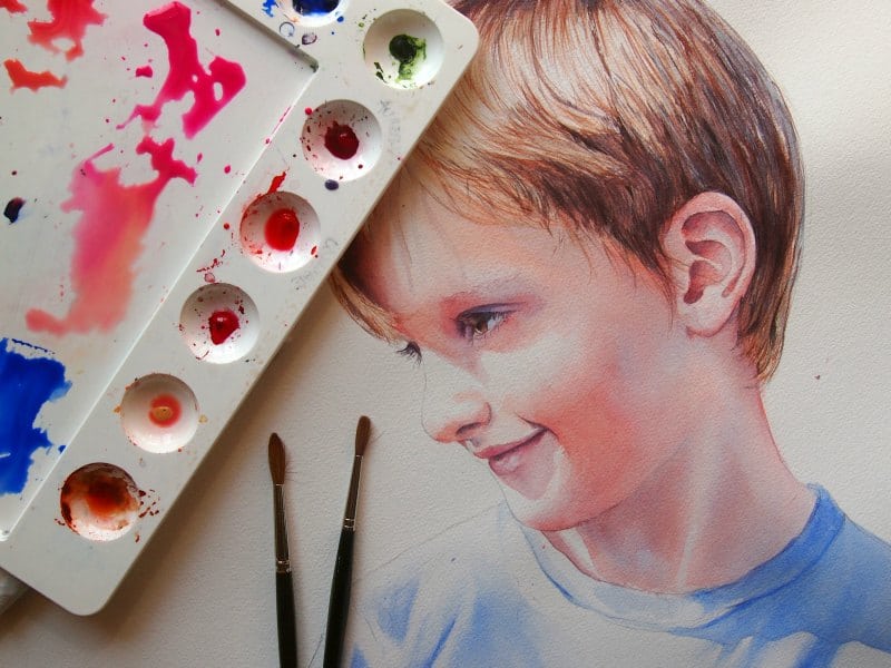
The subject of this watercolor is extra special to me – he is my son, Francesco. An adorable and joyous child, he still has a little bit of melancholy in his eyes. When I took this picture of him, I could see not only his sweetness, but also his enigmatic smile. That’s why I chose this photograph for my portrait. My challenge now is to represent the light in his eyes, his soft skin, and his bright hair in watercolor – by maintaining the freshness of this image’s chiaroscuro (use of strong contrasts between light and dark), which creates an intense and harmonious composition.
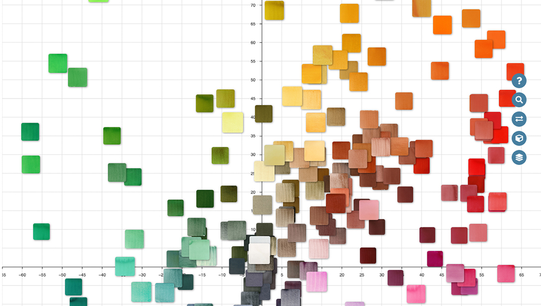
When you paint a portrait, you should choose an image full of contrasts – this will help make your work more intriguing and you’ll have more fun playing with colors. The study of colors is important – you need to know their characteristics to understand the effects you can get. Make colors become your best friends and you will improve your skills. My way of painting is slow and precise because I care about every fascinating detail. But know when it’s time to stop so you don’t risk losing any freshness in your piece.
I chose a cold press watercolor paper, 300gsm (140lb). Drawing is an extremely important element for a successful portrait. So I precisely define it in every single detail. I draw the subject first on a separate sheet of paper, and then I re-do it to avoid making too many unaesthetic erasure marks on my final watercolor sheet. I use semi-hard 2H – HB pencils. The design is supposed to be clearly visible, but if in some areas the line is too intense, I make it lighter with an eraser.
Now I re-draw the lines with a round, natural-hair brush (number 1 or 2) on dry paper. My palette contains Ultramarine Blue, Quinacridone Sienna and Pyrrol Crimson. This step is crucial because it helps me get in harmony with my subject and it’s a second study of the facial features. I always start by drawing the eyes because, in my opinion, they are the most significant elements in a portrait. The gaze must be alive, transparent, luminous – and by looking at it, the viewer should be able to perceive the subject’s thoughts.
Next comes the first color transitions. Using a round, natural-hair brush (numbers 8 or 10, or a 12 mop brush), I lay the first color as a glaze across the subject to create a base of wet paper. I add the following colors to my palette – Opera Pink, Naples Yellow and Quinacridone Purple. I clearly define the contrasting areas, allowing the subject to become more three-dimensional.
My way of painting involves several layers, so I carefully choose my colors, preferring the transparent ones. It’s time to add more colors to my palette – Organic Vermilion, Aureolin Cobalt Yellow, Permanent Red and Sap Green. I keep his hair area dry and paint using small, round natural-hair brushes (numbers 1 & 2). In contrast, I paint his shirt and the face on wet paper.
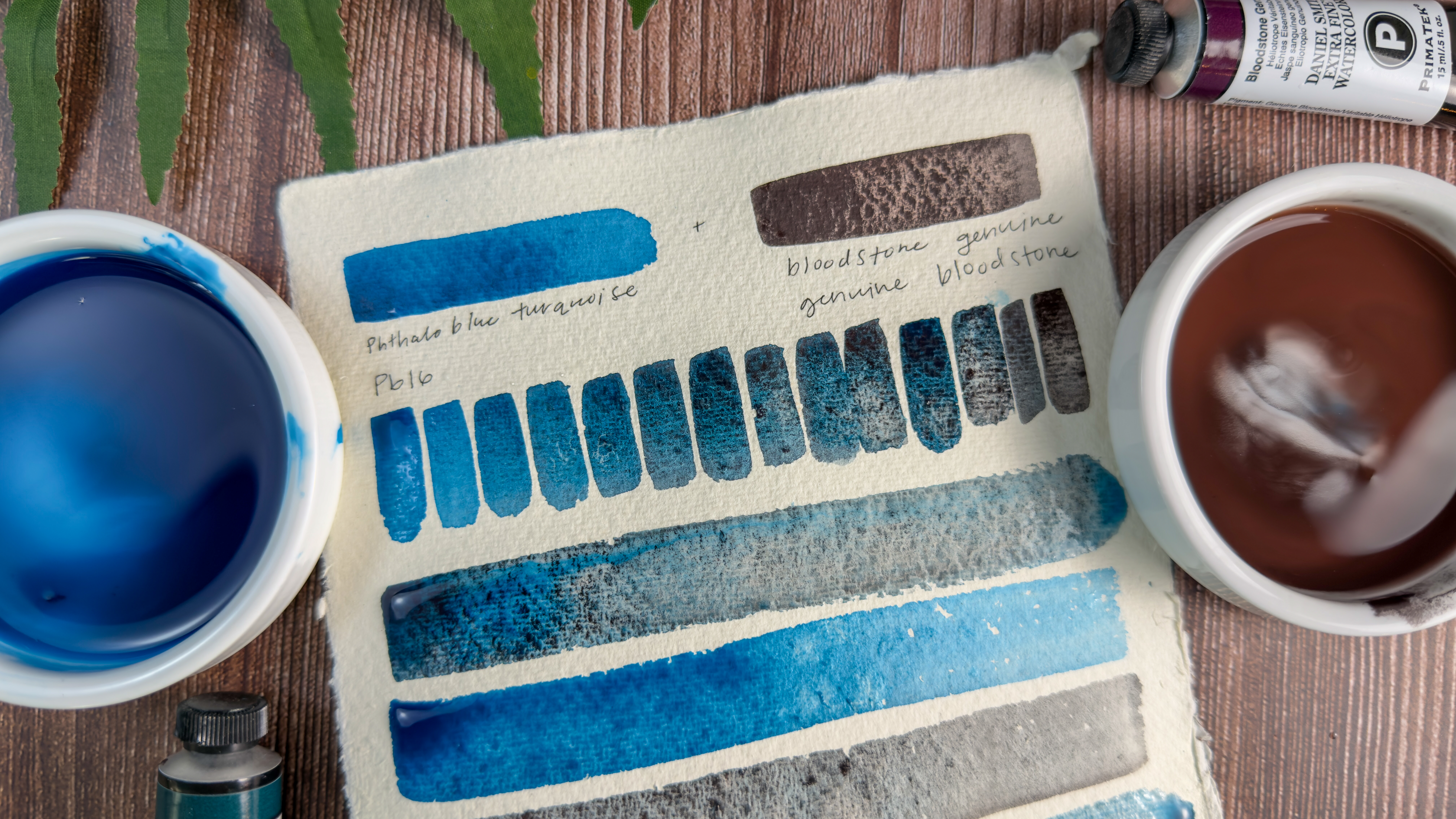
Once the subject is defined, it’s time to paint the background. Harmony and intensity between the colors of the subject and those of the background are imperative. Before starting, I always do some prep studies to identify which colors are best for chiaroscuro, so I won’t lose the brightness and transparency of the background. In this phase, I work on wet paper and use 40 – 45 mm flat natural-hair brushes. I decided to use Ultramarine Blue because it’s present in the shadow areas of his t-shirt and his complexion. The second color in my background is Amethyst Genuine, which immediately fascinated me because it’s very intense, brilliant and granulating – it harmonizes perfectly with the subject.
Once the background is complete, I go back to further harmonize some areas of the face, hair and t-shirt. I glaze some parts with the background colors to add greater intensity and a better sculptural quality. To finish, I use round brushes (numbers 1 & 2) to insert all those little details that I hadn’t paid attention to before. Using Titanium White and Permanent Yellow Deep, I create small strands of light in his hair and eyelashes. Then I add a bit of shadow around the eyelashes and the pupil of the eye. I shade a few strands of hair with Ultramarine Blue and my painting is complete!


