So what exactly is “Expressive” painting?
Well, when I think of expressive painting I think of the Fauves, the Expressionists, Post-Impressionists—painters like Vincent Van Gogh, Henri Matisse, Pierre Bonnard, and Andre Derain to name just a few. Painters who decided to disregard realism and express themselves through vivid, non-naturalistic color and composition.
These were artists who painted in a style that is highly personal and subjective. Of course the basics of painting must still be learned—how to mix colors, how to compose a picture, using light and dark values to attract the eye but beyond the basics the painter can invent invented their own approach. This is why I choose to paint in an “expressive” style.
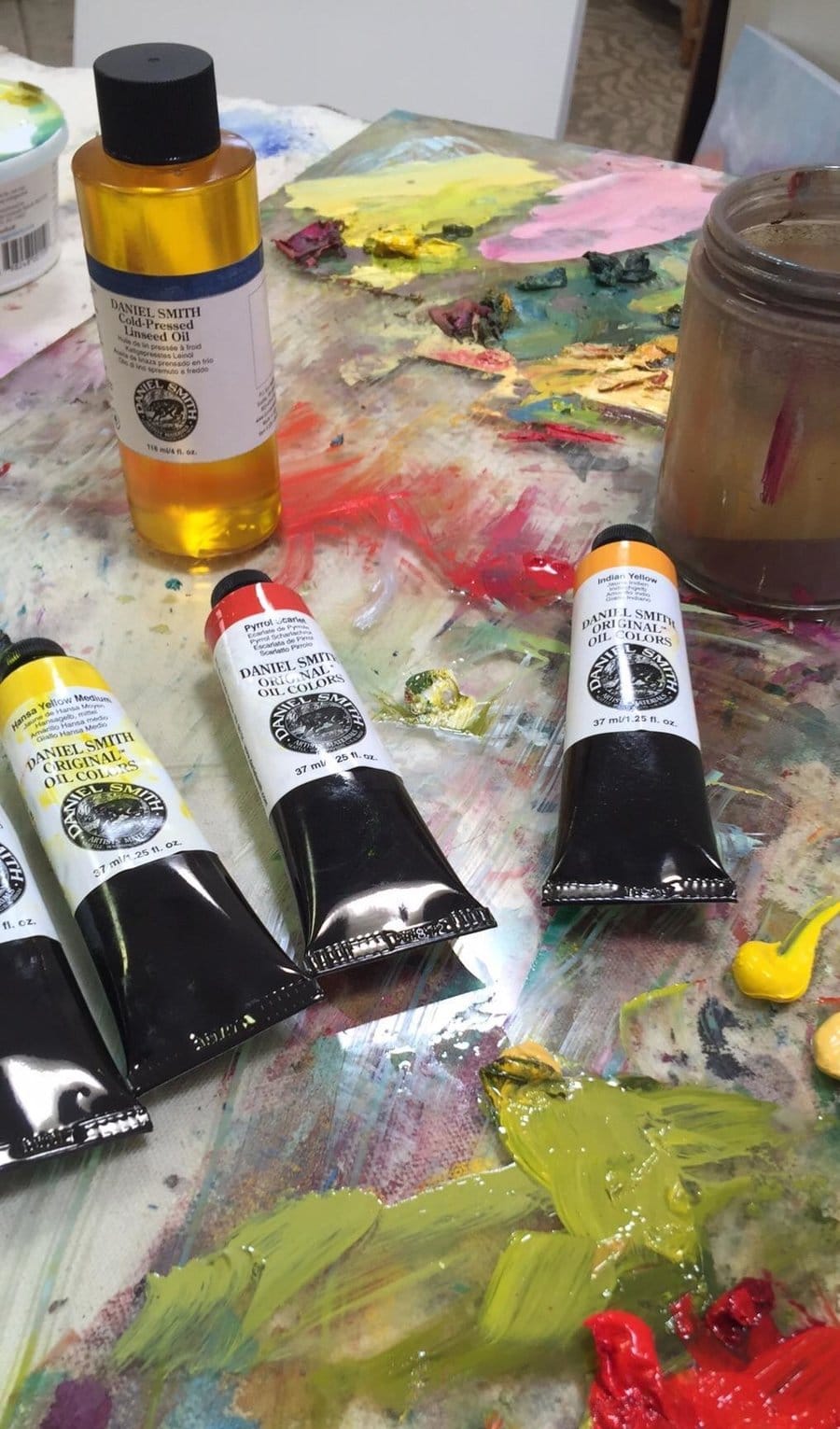
I love painting with luscious oil paint and especially love the vivid colors DANIEL SMITH offers:
Buff Titanium
Cadmium Red Medium Hue
Green Gold
Hansa Yellow Medium
Indian Yellow
Lemon Yellow
Light Blue Violet
Permanent Alizarin Crimson
Phthalo Blue Green Shade
Quinacridone Rose
Titanium White
Ultramarine Blue Deep
Viridian
Yellow Ochre
I like to have a warm and a cool version of each of the primary colors – blue, red and yellow. The painting mediums I chose include: DANIEL SMITH Painting Medium for Oils and Alkyds and DANIEL SMITH Cold Pressed Linseed Oil.

I selected an 18″ square wood panel. I love the square shape for floral still-life paintings, it adds a modern feel to the piece. My brushes are always “bright” bristle or synthetic brushes, stiff enough to stand up to vigorous brush strokes. I find that natural hair brushes become too limp when wet to create the expressive brushstrokes I prefer. I think of brushstrokes as the personality of the painter and try hard not to smooth them out as I add more paint.
My inspiration is a simple floral arrangement which I usually create from grocery store flowers (except in summer when I can find flowers at the local farmer’s market). I envy those areas of the country which have year round supplies of fresh flowers! I don’t fuss over the arrangement, I just choose the flowers which move me that day in one of the vases I keep in my studio. Remember the still-life setup is just for inspiration— to spark an idea, not to be reproduced realistically. I keep an odd assortment of vases, tablecloths, remnants and flea market fabrics in my studio which I use as my inspiration.
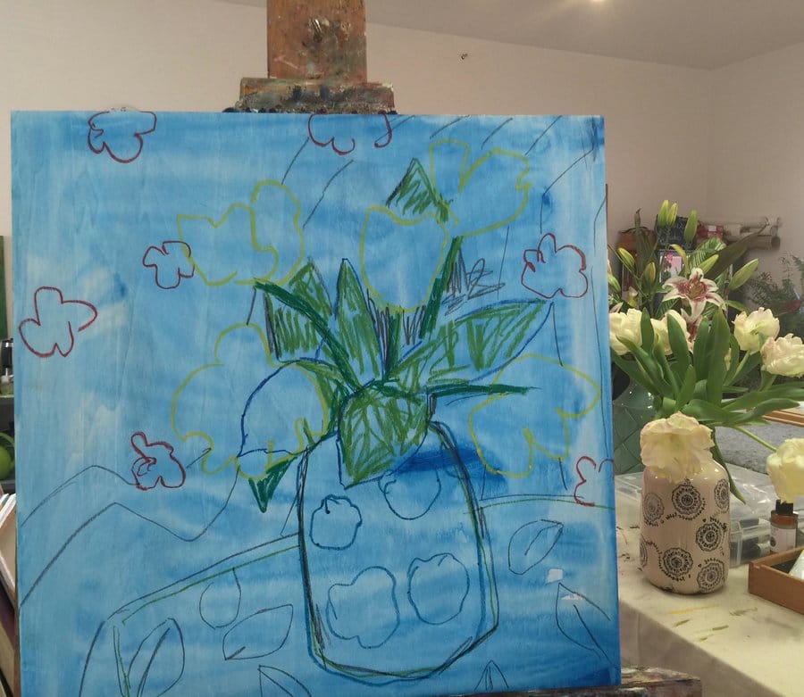
With my largest brush, I first applied a thin transparent underpainting of color thinned with odorless mineral spirits to the surface of my panel and allowed it to dry. The underpainting in this case was Phthalo Blue applied very thinly. The underpainting serves two purposes—it does away with the scary white blank canvas immediately and provides a sparkle of color underneath the layers of paint.

I loosely sketched in a map of the composition defining the placement of the table, vase and outline of flowers. Sometimes I will use the underpainting paint to create the map, which places the objects on the painting surface and gives life to the composition. I then stepped back and took a look to see if I was happy with my composition. If it needed to be changed, I could always wipe off the drawing with mineral spirits and have a do-over.
My method of adding paint at this point is to create layers or veils of color, starting with oil paint thinned with linseed oil and moving to progressively thicker paint using the DANIEL SMITH Painting Medium. I loosely block in the shapes of objects using darker values of colors, painting from dark to light. My mantra is thin to thick, dark to light.
I continued to add variations of color to each area of the painting, bringing the entire painting along together in layers. When my momentum slowed, I stepped back to take a look and to ask myself what’s working and what’s not? This is the point when I made adjustments to color and values. I try to stay loose and expressive without adding too many details in the flowers—don’t take this part too far or your brain will shift into realism mode. I always quit for the day before I think it is finished and let the painting rest until the next day. The next morning I added details like the stamens on the flowers, which add a touch of value contrast, as well as the tablecloth pattern details. After a few tweaks of the values in different sections, I was satisfied enough with this painting to use it on advertising for my upcoming solo show!

Related Posts
Nothing Found


