Share:
In this step by step I will be showing you one of the many different ways of painting texture with watercolour that I employ when working. I have experimented with watercolour off and on for 37 years but really only in “anger” for 22 years. That was when I found out how much I could manipulate and mould this incredibly versatile medium, but its secrets were only revealed when I had become completely exasperated by it.
I was travelling through China in 1996 after I had won a travelling scholarship in Scotland, this meant that through necessity of travel, I was forced to work with watercolour. I had been working on a painting in my hotel room one day when I became incredibly unsatisfied with the quality of my paint handling. Frustrated with the picture, I mixed white watercolour and covered the painting completely in white with no regard for the image underneath. It completely obliterated the initial piece and the colour of the painting mixed with the white rendering the final wash a pale greenish tint.
Pacing the hotel room rather angrily I considered how I was going to overcome this most recent setback when I noticed that the painting, which was drying in the corner of the room, to my surprise was slowly rising to the surface again. It was soft and muted and very atmospheric, and I began to see the potential it didn’t have before I had tried to erase it. I started to attack it with clean water to reveal lighter patches underneath creating a much more interesting painting.
This was my Eureka moment and one that allows me to stick with a painting long past the point where most artists would give up on a painting as a lost cause. It also means that my paintings can take quite a considerable length of time to develop.
In this painting demo you will get the benefit of that Eureka moment as I use it in a technique that is fairly idiosyncratic.
The painting is of a subject that has become synonymous with my work, a door with a rusty lock. I experimented with three different versions of this painting all at the same time. I also started with a quick sketch using just Cobalt Teal Blue and Quinacridone Burnt Orange. I really enjoy painting with a range of textures and thus old doors are a perfect vehicle for exploring my techniques. I can’t remember my first old door painting, but I’ve been painting texture through flaking paint surfaces, wood and rust ever since I graduated from Art school in 1987/88. My first paintings were metaphysical in nature, but they also hinged on detail and surface texture.

Shadow Watcher II watercolor painting in the studio.

Shadow Watcher sketch
This sketch was produced on handmade paper to consider the composition and the colour scheme. When I work on my sketches they are really to fix the idea in my head and can be very quick and loose. I won’t even refer to the surface detail unless its very specific and unusual. The sketch is to create an impression and will be always unfinished and perhaps abandoned fairly quickly once I know what my goal will be. This is no exception.

1. Masking tape covering the back of the watercolor paper. Watercolor paper stapled down.
1. I started out with a piece of 300 gsm (140 lb) Handmade paper which has been “stretched” by applying masking tape, doubled over, all across the back of the paper surface. I then staple in the corners to provide an anchor and a little strength. I use this method so that I can paint to the edge of the paper as I love the deckled edge on handmade papers.
Tip – I use 2-inch masking tape and double it over in 2-inch rectangles all across the surface. This method takes time, but you can start to work right away as there is no drying time like traditional stretching with gum strip.

2. After applying thick watercolor paint, and sprayed with water.
2. I first apply paint to the watercolour paper by painting thick watercolour paint on a piece of cardboard and pressing that onto my paper. For this, I used Manganese Blue Hue, Cobalt Teal Blue and Chinese White watercolour straight from the tube onto the cardboard surface. I then mixed the paint with a brush and pressed the cardboard onto my watercolor paper. Next, I used a plant sprayer to spray water to soften the paint, and allow it to “run” down the board. I work vertically with watercolours and this stops me from creating puddles in my work.

3. After spraying with Quinacridone Burnt Orange Watercolor.
3. I then proceeded to spray the surface with Quinacridone Burnt Orange and water mix. This must be fluid enough to not clog the plant sprayers mechanism but not too fluid that it has no presence. Let this flow then dry with a hairdryer. You can now perceive some interesting surface textures.
Tip – you can create a bit of a mess on the floor of your studio, so I usually put a plastic sheet under my easel and paper towels along the bottom of the drawing board to catch the excess paint.

4. Mapping out the basic shapes with an 8B pencil
4. Once this surface has dried, I map out the basic shapes with an 8B pencil to make sure I can see the lines easily against the painted surface. I then wash out the lighter areas with a stiff brush and clean water, dabbing continuously with paper towel.
Tip – Try not to remove all the paint in this area. I prefer to leave some residue behind to help with the texture later.

5. After blocking in the shadow /dark areas with Prussian Blue and Quinacridone Burnt Orange.
5. Using Prussian Blue washes and Quinacridone Burnt Orange washes (separately) I block in the shadow /dark areas. Be very careful not to agitate the surface by repeatedly going over an area with paint. This will have the effect of removing your surface from the picture as you try to add colour.

6. After lifting a little of the paint surface to lighten it and add more texture.
6. After adding a few layers of colour I decided that the darks had become too dark and a little flat, I decided to lift a little of the paint surface to lighten it. I began spraying the painting with clean water then left it for a moment or two before laying paper towel down on the surface and began lifting out some of the paint. Not only does this have the effect of making the image a bit lighter, it adds some interesting texture at the same time.

7. Adding splattering. Also details with a fine brush and Van Dyck Brown.
7. Once I have laid several flat and textured washes down, I start adding paint with some splattering. This creates texture and allows me to add more paint without physically touching the painting with a brush. I have also started to use a 2/0 brush or any fine pointed tipped brush to start developing the detail. I begin putting in marks on the light area where I want to suggest paint that has flaked up and cracked. It is the detail that my work is renowned for, and it’s this that elevates the painting on to the next level
Tip – I start drawing with Van Dyck Brown and a small brush, really starting to sharpen everything up. If I don’t take care of the drawing at some point in the painting, it will not have the refinement and quality that I’m searching for. Usually if a painting isn’t working its solved by reassessing the drawing and this can be done at any point.

Finished Painting – “Shadow watcher II”, watercolour on handmade paper, 22 x 31.5cm
Tones are deepened, colour is strengthened, and detail is applied, the painting is now complete. As you can see the detail has been intensified and I really enjoy this part of the painting, although it can take some considerable time to make this happen. Using a small brush with a mix of Van Dyck Brown and Prussian Blue I begin to work across the surface of the painting paying attention to the different textures you would expect to see from different materials. This is the reason my paintings take a while as I really get to grips with what constitutes as rust or wood, etc. Most of this surface detail is coming from my imagination as I have spent many years observing my subject matter and instinctively know what I need to do to make it work. I have also added a layer of tint, made of Cobalt Teal Blue and Chinese White, to the lighter area.
Title
The painting is called “Shadow Watcher II” as this is the second painting of this subject matter, which is very unusual for me. I tend not to do two paintings of the same size and composition but in this instance I did them at the same time as an experiment, employing two slightly different approaches.
I have also developed a slightly larger piece with a composition which is closer to the original sketch. This has not been completed at the time of writing. The title refers to me, I’m the shadow watcher as I really pay attention to the movement and shapes of shadows when I’m working. While painting outside I will take constant photos of the subject as I work since the light will change all the time and I like to have a record of its movement while I’m working. The shadow describes the object its being cast from, the direction and the intensity of the light falling across it. That is why I particularly enjoy going abroad as the sun is strong and constant. The light in Scotland fluctuates all the time due to the amount of clouds we have in the sky and the light itself is not as intense as it is very rarely high in the sky, and there is usually a thin veil of wispy clouds obscuring the brightness.
Colours
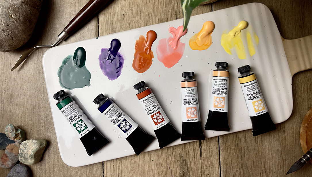
The DANIEL SMITH Colours used in the painting; Lavender, Van Dyck Brown, Quinacridone Burnt Orange, Prussian Blue, Manganese Blue Hue, Burnt Umber, Indian Yellow, Cobalt Teal Blue, Quinacridone Violet and Chinese White watercolour. For me this is a limited palette, I love to use a wide range of colours and employ most of them as pure washes mixing straight on the paper. In this instance I didn’t use any of the DANIEL SMITH Watercolour Sticks.

Angus McEwan palettes with DANIEL SMITH Watercolors.
There are four colours which are ever present in my paintings – Cobalt Teal Blue, Manganese Blue Hue, Lavender and Quinacridone Burnt Orange. This painting contains all four of those colours, but the two predominant ones are the Cobalt Teal Blue and the Quinacridone Burnt Orange. There are other colours used throughout the painting, they are primarily used to lighten or darken the key colours.
My DANIEL SMITH Watercolor Dot Cards have a small selection of must have paints from my palette.
They contain colours I couldn’t do without and usually comprise of colours that are difficult to reproduce from a basic colour range due to their intensity and strength of pigment. The latest colour in the DANIEL SMITH range is Lavender and it is a colour that I now use in all my paintings. Cobalt Teal Blue and Manganese Blue Hue are also must haves, and almost always used colours.
Lavender
Cobalt Teal Blue
Cobalt Blue
Manganese Blue Hue
Cobalt Blue Violet
Prussian Blue
Quinacridone Violet
Moonglow
Phthalo Green (BS)
Olive Green
Phthalo Turquoise
Indian Yellow
Quinacridone Burnt Orange
Cadmium Orange Hue
Organic Vermilion
Burnt Sienna
Burnt Umber
Van Dyck Brown
Why I choose DANIEL SMITH Watercolors
“I love the intensity, the ease of use, the incredible variety of colours and the excellent quality of DANIEL SMITH range. They always respond the same way, time after time regardless of the substrate. This is important to me as there are so many variables when painting, being able to rely on the paint quality is a major component of a successful work of Art. Simply put, DANIEL SMITH gets the quality and constancy right every time.”