Share:
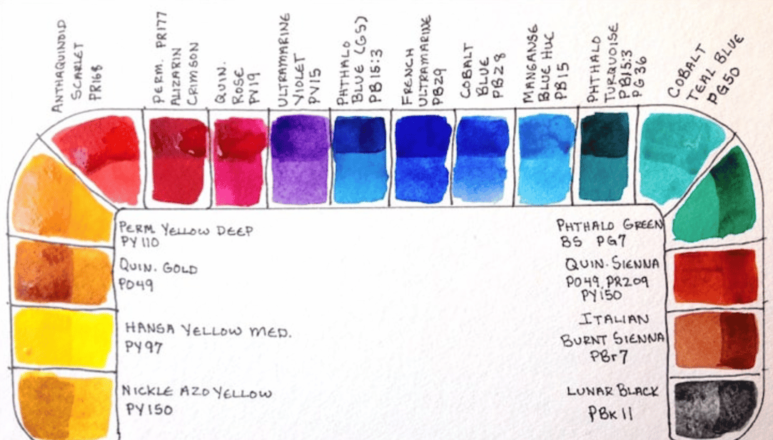
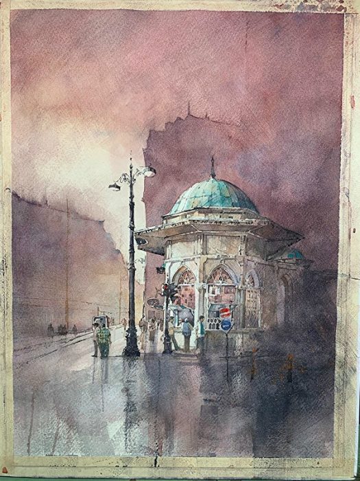
I’ve been busy in the off season working in my studio and trying out some of the new (to me) DANIEL SMITH colors and deciding whether or not to make a few changes to my palette. As always with these new paints I like to test how they compare with similar colors I already use and combining them in new and interesting ways. The new colors that make up most of the following painting are Sodalite Genuine (a PrimaTek) Raw Sienna Light, and Quinacridone Rose. When testing new colors I like to see how they will mix together and also how they glaze upon earlier washes. I’ve been doing a lot more dry brush work, which can be a little intimidating, but once you get the hang of controlling how much water / pigment is in your brush vs the wetness or how dry the paper is, the results can be fantastic. These skills are extremely useful if you first practice them on a blank piece of paper with no drawing. I find that experimenting on something you’ve taken time to draw makes one more likely to hold back and become protective of the image. If there’s nothing to protect you can experiment to your hearts desire and find new ways to express yourself. In this case the three colors I chose had a direct effect on how i envisioned the atmosphere of the painting and, as you can see from the step by step photos, tie the image together quite nicely.
I paint using high quality, synthetic brushes, and in particular a No. 12 round, 14 mop, a Mottler 18 brush, and a small palette knife for fine lines. The Mottler is mostly for my dry brush in large areas and the round does the detail. The mop is a jack of all trades and allows me to put a lot of water on the paper and play with wet in wet situations.
The paper I used for this painting is 140# rough watercolor paper. The original painting is done larger than I expect it to be so I can crop if necessary. The final image is 18” x 12”.

Iain Stewart with his Sebil Bufe- Istanbul watercolor.
Before we jump in and geek out, please allow me a moment to talk to you about how I approach my work. If I set out to create a masterpiece I will typically fail at that attempt. When I work I try to have as much of the image as I can in my head, meaning what steps I will take and in what order. Where I will save my lights. The color scheme and finally, the incredibly freeing feeling of “well lets just see where this takes me.” After a little reading at night and as I begin to drift off, I will usually be painting it in my head. It’s a lovely way to fall asleep, but be forewarned, a good idea will have me sitting bolt upright and running to the studio to make notes.
I work with the understanding that I am allowed to fail and that I paint for my enjoyment. I find that when I follow these rules I am lost in the moment and, for me, that is the best place to be.
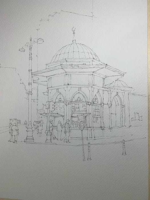
Step 1. The drawing.
Step 1 – The drawing
Ok so this looks fairly complicated and it is to a degree. I have a background in architecture, and I am an architectural illustrator still. So the detail beast does strike me at times, and I’ve learned to go with what I want to paint and how loose or detailed it may be. The next subject is a real departure. How I complete these drawings is to some a tedious exercise. I begin with some small thumbnail sketches and when I’ve settled on a composition I begin to draw. The technique is one I was taught in architecture school. and when I want detail it’s still my go to. I draw the image on trash / trace paper and then cover it with another layer of trace so I can begin cleaning up / changing things here and there. This process can take a while to get right. It’s basically onion skinning. Meaning that I can see the drawings beneath and massage them as I go. Once the drawing is completed to my satisfaction I transfer it to watercolor paper by using a soft lead 2B and tracing the lines I’ve drawn in reverse. I then flip the trace and use a harder lead F to transfer the original lines to the paper. There is no light box or tracing going on it’s just time and patience. I suggest a good book on tape for this step.
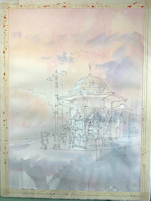
Step 2. The under wash.
Step 2 – The under wash
The first step in all my paintings is the under wash which I use to set the colors of the image and reserve my highlights. I am an ambassador for Daniel Smith and they have generously given me many paints to try. For the last month or so I have been testing and choosing new colors for each work. This time it’s DANIEL SMITH Raw Sienna Light, and Quinacridone Rose with Sodalite Genuine for the darks. I paint with a lot of water and drop in colors as I go. This requires knowing what the wetness of your paper is vs how much water / pigment you have in your brush. I very rarely use masking fluid preferring to try and save the highlights from the beginning with the brush, and scrubbing or using a little gouache at the end. I’m using less and less of the opaques now and enjoy the little mistakes that happen. As you can see at the bottom I use a stiff 2″ blending brush to create texture by dry brushing and cross hatching.

Step 3. The glorious mess.
Step 3 – The glorious mess
As you can see here I’m beginning to carve out the light and allow the drawing to become more obscured. I enjoy taking something quite neat and throwing what I can at it to disturb the stiff feeling of a highly detailed drawing. I always say there are two drawings in every painting. One done with the pencil that no one sees at the end, and the most important one done with the brush that is visible to all. These values may seem very dark at the beginning but rest assured I paint with the knowledge that my value plan will work. I also don’t mind ruining one here and there, and the energy in these early stages certainly transfer to the final. Lots of dry brush, spray bottle, wet in wet, lost and found edges.

Step 4. Blocking out and adding main color scheme.
Step 4 – Blocking out and adding main color scheme
This is basically another go at the last step but I begin to incorporate and work some of the major details. I do this so I can see where the painting is headed color wise, and to begin pushing the light to where I want the focal point. A little Cobalt Turquoise for the dome and putting in the major forms of the background buildings and figures. You can see all the blooms and drops forming, and I find this is where a lot of people lose sight of their original idea. Trusting that we are still in the early stages of the painting and that tonal value will work, I paint the detail so that I can have something to judge the rest of the painting with as I go looser in the background.

Step 5. Pushing the light.
Step 5 – Pushing the light
Ah my favorite part. Using a dry brush and a deeper mixture for the sky of Sodalite Genuine, Quinacridone Rose, and Light Raw Sienna I start to push the background away to create a sense of distance within the image. A lot more dry brush with heavier mixtures. (Note the background buildings are beginning to fade when they were fairly pronounced on the last step.) I also put in some of the final darks again to judge how far to push the sky and buildings in the background. I need a final tone to work from here so that I don’t go too far. The cross hatched sky is beginning to work but the cloud that is lit by the sun to the left is still too pronounced. Don’t worry I’ll deal with you later. Also note the shape the cloud is. It’s following the built form at left almost perfectly. I’ll have to do something about that. This is also where I’ll let Noelle have a look. Her grimace tells me all I need to know. She’s a fine art critic now after 15 years of practice.

Step 6. Close up of detail.
Step 6 – Close up of detail
Just a quick detail shot to show you the effects of the dry brush on the building and beginning to pull shapes together.
Step 7. The Wonderful mess.
Step 7 – The wonderful mess
Ah my favorite part. Did I say that already? Hmm. Bringing in the final darks with Neutral Tint and deepening the sky. This is where my internal timer begins to hum slightly. I know I’m close but too much of a good thing can turn nasty very quickly. Throwing darks at the right of the building and putting in the last details on the subject. This is a very fine line that I enjoy walking. It’s looking good but I cannot let this become precious. If there’s any sure fire way to ruin something, it’s to let it become important before it’s worth it. You will coddle your paintings and want to “mother bear” them. Paintings done in this style always tend to work better when you start tossing the little birds out of the nest and seeing if they can fly. I do a lot of stepping back. Looking at it backwards with the mirror above my desk and just walking away for a bit so my eyes can re-adjust. There will always be something you missed. I also begin lifting some of the darks to allow them to breathe a little. I find darks are most interesting when they are allowed to change in value. Again in this painting style I find a large area of almost screen printed darks will kill it very quickly. This is also when I will often put a painting in “time out” and not look at it for a day, week, month…. it depends on how naughty it has been.

Sebil Bufe – Istanbul, by Iain Stewart
The final. Sebil Bufe – Istanbul
The hardest part of any of these is how to know when to walk away. I write notes for myself after looking at the last stage and look very critically at what I want the painting to convey, and where I am. I also look for patterns or places where major shapes need adjusting via dry brush or obscuring areas. I decided the sky needed to become darker so introduced a mixture of Quin Rose and Sodalite. I also changed the shape of the cloud and added some orange to the traffic cones. All very slight changes but necessary. Lastly I let it steep for a few minutes and scan it. Then the real fun begins. I always believe that no matter how much planning I do, I have to listen to what the painting is trying to say to me. I play with different crops and adjusting tonal hierarchy until I am pleased. If I have to paint more and re-scan so be it. So to quote Eddie Murphy – “it’s as simple as that!” Now it goes to sit in the corner and rest. I will look at it again in a week or so and see if I want to change anything but for now I am happy enough.
I hope you have enjoyed this somewhat rambling step by step and possibly gleaned some ideas. If there is anything I think I should stress, is that I feel you have to know that during the middle stages of a painting, it is going to look flat. I call this the doldrums. All your values are fairly similar and only a bold move with some darks will put some wind in your sails. Believe in it. Watercolors typically go from beautiful to quite ugly and hopefully beautiful again. Knowing that you have something with potential in these ugly phases that will pull it out of the mud is key. You will ruin many paintings using this method but I find ruined paintings teach me better than any good one. Good paintings, as I have said in the past, are like drinking buddies. They just say “hey man, that’s just great dude…uh pass the peanuts.” Bad paintings, ruined paintings, teach. They are the stepping stones to brighter things. Ruminate on your work. I suggest that after planning a painting and not achieving the results you hope for you take some time and write down your plan of how to paint it again. That tends to get both sides of your brain working together and the results can be quite powerful. Thank you for taking the time to read this and I hope you find it enjoyable.


