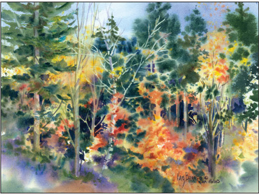
Many of my paintings start with a carefully composed photograph, from which I design the painting. I do a relatively simple contour line drawing in pencil and frequently use a somewhat limited palette.
However with the creative process, nothing is written in stone. Many times I find that the subject lends itself to a very different painting technique and a less restrictive use of color. It would be quite tedious and limiting for me to tackle the subject of fall foliage in the well-planned manner mentioned above. As well as my subject dictating my approach, I also let my mood and spirit lead me.
With this subject, a wonderful fall scene filled with color and contrasting values, the reference photo is only a springboard for the rhythms, colors, and textures I wish to impart to the viewer. In this painting I did not feel a drawing was necessary and I let the paint lead the way. This subject says to me, “Let’s get loose and sling some paint!” I may use every color on my palette that says fall to me!
I began on really saturated wet paper (both sides) then splashed, spattered, sponged and carved images. By incorporating my imagination, sparked by a photo, and led by what presents itself to me, my painting unfolds before me.
This demo evolved in exactly this way and I recorded the process as the painting and I worked together. The joint collaboration of the paint, paper, water and my input was a pleasant journey to a satisfying conclusion. I hope you will try taking a similar trip with me. I’ll talk you through it.
The process
1. I used a piece of ½” thick board, just slightly larger than the paper, as a mount for 140# cold press watercolor paper. Do not attach it to the board now. If you need to re-wet edges during the under painting, you can lift the paper and spray with water underneath so you won’t disturb the surface image.
2. Wet both sides of the paper with a large, flat brush for maximum penetration and even distribution of moisture. Applying liberal amounts of water, wet the paper back and front several times so that as the paper absorbs the water as you add more.
3. Keep the paper shiny wet for at least 10-15 minutes.
4. Make sure the front side is up when you are ready to apply the paint. Let it lose its shine and then rewet one more time. This is an important step in preparing the surface and gives you maximum working time.
5. When the surface is really wet, tilt the board and let excess water drain off. Even moisture distribution is one of the keys to your success!
Here is my plan of attack!
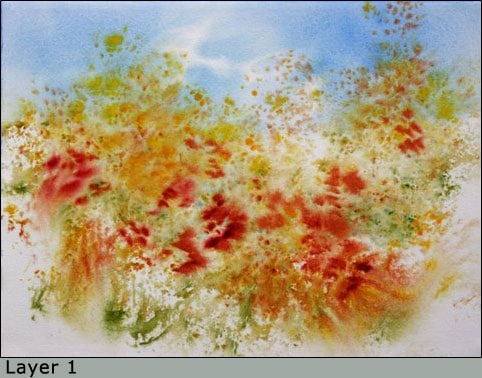
I start working most landscape paintings from background to middle ground to foreground. Values build from light to middle to dark, and soft diffused edges to ragged, to hard. I develop shapes (masses) from large to medium to small. The center of interest is revealed toward the end of the process.
Stay open to changing your plans and direction, as the painting may have its own ideas about where it wants to take you. Have fun!
With your one inch flat brush, pick up Verditer Blue mixed with Cobalt Blue or Cerulean Blue; wash the blue onto the upper third of the painting for the sky. The edges should be soft and indistinct.
With medium density washes of Aureolin, Raw Sienna and Quinacridone Gold, create loose shapes, forming an S pattern through the middle third of the painting.
Allow the washes to mingle on the paper and vary the densities of these colors, using small, medium and large masses where deciduous trees will appear.
Using a rough textured, natural sponge (slightly damp), add touches of Sap Green and Green Gold to some of the areas. Placing one color on top of another, let them mix themselves on the paper softly.
With your #14 round brush, pull color directly from the wells of paint and place (undiluted) onto the paper. I chose Permanent Orange, Alizarin Crimson, Quinacridone Burnt Orange and Quinacridone Burnt Scarlet. Try using short, staccato brush marks.
Don’t rinse between colors and allow the paint to mingle on wet paper.
If mingling does not happen, a little fine mist of water from a spray bottle may get things moving again. At this point, light and middle values should dominate and random shapes should start looking like out of focus trees and foliage. Remember to do some mottling of foreground clutter that will resemble bushes and low growth.
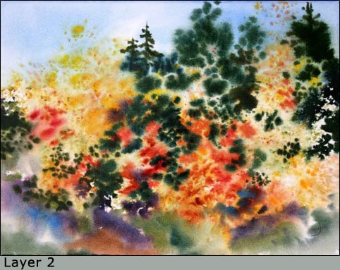
When the paper has lost its shine, but is still cool and damp, paint edges will start to become ragged. This is the time to create some lovely, rich jewel-toned darks to place in the areas between the light foliage. These mixtures can be mixed on the palette and then added to the damp painting.
The trick for really rich darks is to choose the darkest colors on the palette and use as little water as you can. The consistency of the paint mixture should be like soft butter.
As long as the colors are transparent, the mixture will not become muddy. However – get in and get out quick and don’t stir on the paper!
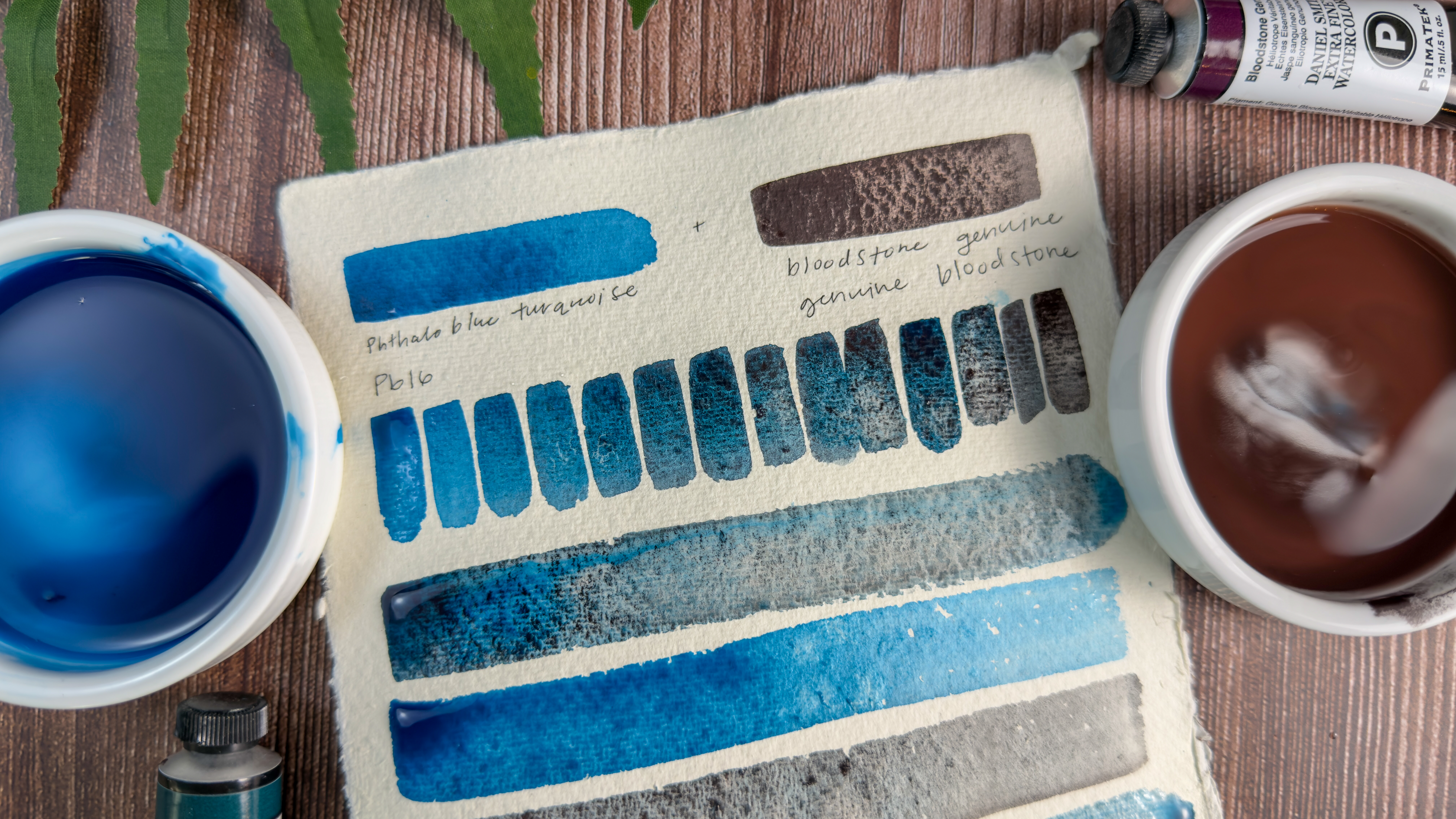
Think about variation with repetition. Weave the darks like threads in a tapestry. Favorite mixtures for my darks are: Pthalo Blue and Sap Green for a dark teal (neutralize with Alizarin Crimson), Alizarin Crimson and French Ultramarine for a deep purple (add Quinacridone Burnt Orange for dark neutral).
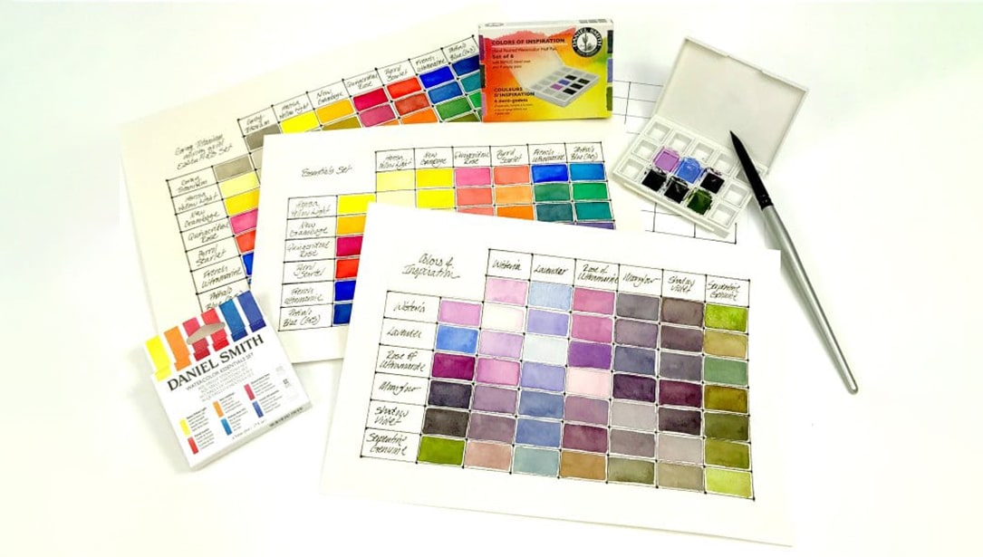
Experiment with other dark combinations of two to three colors and echo them throughout the areas you want to punctuate. Try mixing warm and cool colors together. Opposites on the color wheel give you a great variety of dark neutral colors. Notice the difference when you premix colors on the palette versus when you let them mix on the paper.
Keep alternating colors, values and play along the edges using fanciful brushwork and spattering. I find the #14 round brush in a natural or blended fiber works best. The lower corners of the painting need the weight of darks to ground the scene and make the brights pop – think complementary colors!
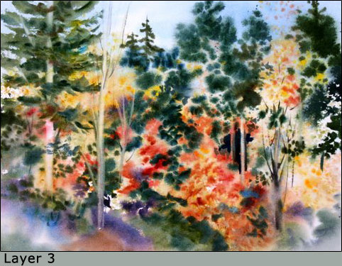
Using the sponge again, apply pure paint and lightly dot into damp passages with a few sparse touches. If paper is moist enough, fuzzy edges will form.
When the paper again loses its shine, lift out a couple of light tree trunks and branches with a 1″ flat brush, clean and squeezed out rather dry.
Paint negative spaces (“paint what ain’t”) between the foliage masses and add a backdrop of dark evergreen trees behind the bright fall trees.
If the paper is moist, the edges of the dark trees will look fuzzy and recede. This establishes a wonderful point/counterpoint rhythm, as well as depth.
If your paper is drying too much and the edges seem harsh (paints no longer move on their own), mist a tiny amount of water and spatter paint into it, or spatter onto the dry paper and immediately mist the spattered paint.
Keep alternating colors and values, and play with edges, but don’t overdo it. It’s so much fun, but remember – as Mel Stabin once told me, PAINT AL DENTE!
Know when to stop!
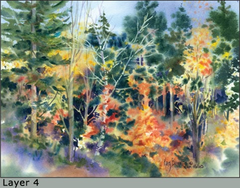
Let this part rest and then evaluate. Explore the possibilities of glazes to warm, cool or strengthen an area. Tweak and critique your painting. What needs to stay, what needs to go?
The final step in my painting was to cut a stencil and lift out light, hard edged tree trunks from the now dry dark passages. This adjustment and a bit more negative painting will make the focal area shine and finishes the painting.
My best advice, trust the process and enjoy the adventure in learning and exploring the wonders of watercolor!
