Do you worry about making mud with your watercolors? Are you afraid to use a staining pigments because it may be too strong and you can’t get it out? Are your darks dull and drab? Do you look at the few spaces in your palette and wonder which of the vast array of colors to buy? As a teacher, these are concerns I often hear and they may be yours, too.
Decisions, decisions – that’s what painting is all about. Do you realize how many choices you make as you move your brush toward a color? First a hue decision – green for example. Then a value decision – light, more water or dark, more pigment. Then temperature – do you want a warm yellow green or a cool blue green? And intensity – a bright green or a dull one? In addition to all these decisions, you also have to choose the pigment. Phthalo Green with its strong staining qualities? Cobalt Green, heavy and thick? Or Viridian – a soft veil?
I have come to the conclusion that all the pigments are wonderful – staining, sedimentary and transparent (I actually like to refer to transparents as “luminous,” since all watercolor, by its nature, is transparent). Each type has both positive and negative characteristics. It’s how and when you use them that makes the difference.
For this demonstration, I created four versions of the same painting. It includes several challenging elements (shown below) that demand different kinds of painting and set up various possible pitfalls.
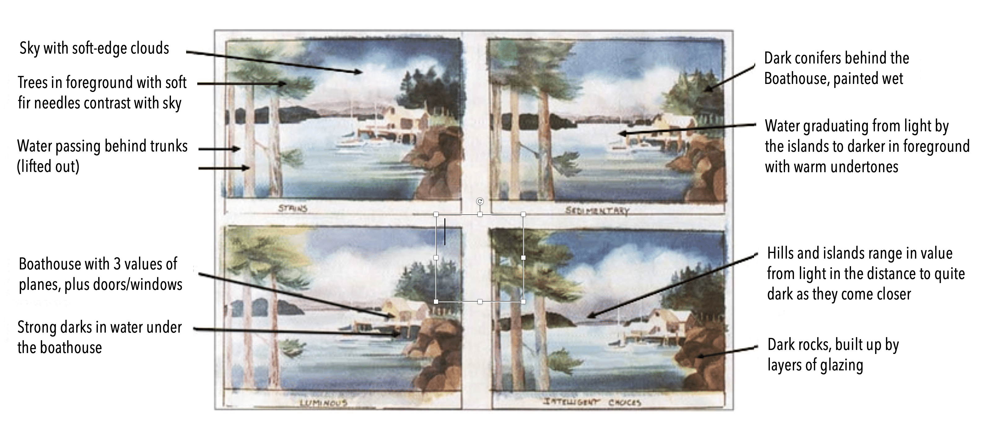
The first painting is executed in staining pigments, the second in sedimentary colors, the third in transparent (luminous) pigments and the fourth includes a mixture 01 what I call Intelligent Choices. I’ll discuss each of the types in turn, showing some of their characteristics.
Staining Pigments
Also called stains, these include the Phthalo colors, Alizarin Crimson, most of the Cadmiums, Permanent Magenta, Prussian Blue. Hansa Yellow, Hooker’s Green, Indigo and Payne’s Gray, Anthraquinoid Red (a lightfast substitute for Alizarin). Perinone Orange (gorgeous!) and all the Quinacridones (which also have luminous qualities – more about them later).
Stains flow beautifully, For example, if you start with Phthalo Blue in a sky, just brush it on, tilt the paper a little, add a little Quinacridone Violet here and a little Phthalo Green there, tilt again, and the colors flow with the damp paper. Before a staining color dries, it’s quite easy to lift out if it wanders into the wrong areas.
Staining pigments stay down. Since during the first wash you can shift them, wash them down or lift them out, they’re very adjustable. But once that wash dries, they’ll stay where you put them. You can glaze over them or work an area back and forth with several brushstrokes and they won’t dissolve or mix with the fresh paint.
Staining pigments are powerful. When you need strength in your hue, use stains in your first wash or first painting of an area. Also use them as powerful under-colors glowing through later washes.
Stains do have some negative characteristics. When glazed over one another, they are at best flat (non-sparkling), and at worst they kill the color under them. For example, if you glaze over a strong saturation of Alizarin Crimson or Anthraquinoid Red with Phthalo Blue, you will get a dark, dark, dead blue.
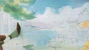
First wash, staining pigments:
See the flowing spread of pigment – it is easy to spread and blend. At the end of the first wash, while the paper is damp but no longer shiny, a thirsty brush (damp dry) is able to easily remove the stain where the tree trunks will be painted.
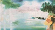
Second wash, staining pigments:
The rocks have become heavy and dark, with the Cadmium Yellow no longer shining through. The sky has good value but it’s flat and matte. So is the near island.
Sedimentary Pigments
Visually thick, sedimentary pigments are often referred to as opaque. I prefer to call them sedimentary, since a stain washed over a stain is more opaque than a sedimentary color washed over a staining under-color. Sedimentary pigments include the earth pigments – Indian Red, Ultramarine Blue and Violet, Cerulean Blue, Cadmium Orange, Cobalt Green and Cobalt Violet, among others.
Sedimentary pigments are beautiful glazed over the stains of a first wash. If you glaze Cerulean or Ultramarine Blue over Anthraquinoid Red, for example, the grains of the sedimentary color separate enough that minute glimpses of the red sparkle through, combining visually with the blue to create a violet effect.
Imagine color as sound. Take Phthalo Blue for example – it has a “note” – it’s stronger with more pigment, softer with more water. When it has dried and Indian Red is glazed over it, they may make a similar hue to the violet you would get by mixing them on the palette, but that mixed color would be one note instead of two. Glazed, you see the harmony of the two hues blending, red with blue showing through. This “chord” effect is why I always use at least two washes in a sky – first the stain, then after it has dried, sedimentary colors slightly different in hue which set up a subtle vibration.
When sediments are glazed over sediments, a thickness or density eventually occurs. This may suit certain dense subjects, but frequently gets too heavy – note the second wash on the fir trees to the left in the sedimentary painting. Another problem – mud happens when, by the third brush stroke, you have dissolved the under-colors so that they not only blend into your current colors, but also leave a scar in the under-layer. Note the bottom of the fir trees to the right in the sedimentary painting.
Trying to change or pick up unwanted sedimentary color is often disappointing because, unlike stains which lift right out at the damp stage of a wash, sedimentary paints settle stubbornly into the pocks of the paper. Even scrubbing dry stains with a wet toothbrush will often pick up more color than doing the same with dry sedimentary colors.
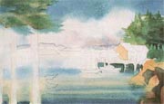
Second wash, sedimentary pigments:
With a second wash on the sky, the foreground water and the trees to the left, they are looking a bit dense. The sedimentary earth colors are fine for the rocks. When I reworked the bottom of the trees at the right. the paint redissolved and scarred. The trees are also moving toward mud.
Luminous Pigments (Transparents)
These include Viridian Green, Cobalt Blue, Aureolin Yellow, Rose Madder. The Quinacridone colors also have luminous qualities, without any negatives.
Many artists, fearing the irrevocable power of stains and sedimentaries’ potential for making mud, have limited their paintings to the gentle glow of Aureolin, Cobalt Blue, Rose Madder and Viridian. Their transparency allows each of many glazes to show through, but they also are somewhat weak.
Use luminous colors for fine-tuning and adjusting. They don’t have the stains’ habit of lying on the surface, masking what’s beneath. Except for Cobalt, they don’t have much graininess. If your field is too cool, warm it up with a glaze of Aureolin. Or if your background is jumping around too much, glaze it with either Cobalt Blue or Viridian. It will calm down and settle back.
The problem with only using luminous pigments is the difficulty of getting strong darks. Their delicacy works for a peace rose, an orchid or the delicate skin of some redheads, but not for a wild storm at sea or a deep bank beside a stream. The deepest value of these hues straight from the tube is mid-range. Like having a tenor sing Old Man River, it’s just not the same as a bass!
Luminous pigments also dissolve like sedimentary pigments and may rejoin the solution. One time I had blocked in the shadows on a face in Cobalt Blue and was glazing over this with skin tones. As I worked, the poor lady in my painting developed what appeared to be a skin disease around the edge of the shadows of her eye sockets. As I continued to work on her nose, the shadow kept dissolving and shifting left until she looked like a boxer with a broken nose. As I adjusted the color of her skin, I longed for shadows in a stain that stayed put.
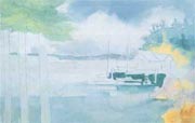
First wash, luminous pigments:
The sky wash with Cobalt Blue is grainy. I’ve already applied second washes over the trees behind the buildings and the water under the dock. Even a fuIl-strength mix of Viridian, Cobalt Blue and Rose Madder is not dark enough to make the water under the dock recede.
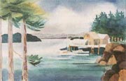
Luminous pigments – complete:
There are nice transitions in the distant hills, and the sky and water are luminous, but grainy. Alter several glazes, the rocks are finally dark enough, but have lost the glow of the Aureolin. The far fir trees are still too light and the near island looks a little boring.
Enter the Quinacridones!
I started The Hills of Langada during a demonstration, just as the Quinacridone watercolors were first being introduced. I squeezed a selection onto a new palette and proceeded as always using stains first and over-glazing not only with lndian Red, Cerulean Blue, Cobalt Green and Ultramarine Blue, but also Cobalt Teal and the new Ultramarine Violet. Wow!
I used the Quinacridones as stains. With their wonderful glow, Quinacridone Gold and Burnt Orange have phased out Burnt Sienna and Raw Sienna on my palette except when I need graininess. Gradually, I discovered that the Quinacridones not only have the power of stains in the first wash, they also have the luminosity of the transparents. This means you can choose Gold, Burnt Orange, Rose and Violet (and I have friends who insist on Coral and Magenta) to fill out the spectrum on your palette.
Note the differences in the foreground of The Hills of Langada where the underwash was Cadmium Yellow Light, compared to where it was Phthalo Blue (left) or Phthalo Green (right). Most of the adjustments on top of these were done with the Quinacridones.
The Quinacridones are great to use any time – they stay down, they glow and they’re luminous!

The Hills of Langada by Caroline Buchanan
Intelligent Choices
My palette and the way I use pigments have evolved over the years. First I worked exclusively with stains, then I discovered the importance of beautiful darks and luminous transparents. By using “Intelligent Choices,” you’ll enliven the color in your paintings without overworking them. You can wet the paper as often as necessary without fear of the colors washing up. You can paint boldly when needed, subdue colors without getting mud, and maintain the freshness that conveys watercolor the best.
- For the first wash, use stains and Quinacridones for flow, depth of color and easy lift-up while still wet.
- In the second wash, use sedimentary colors over stains for sparkle. depth and vibration.
- Add Quinacridones as needed for lively hues.
- For fine tuning, use luminous colors for final glazes and details, along with Quinacridones.
When starting a painting, I put some color everywhere I don’t want white. I mix staining colors on the paper, letting hues run into each other for subtle shifts of color. I paint in under-colors where I’ll glaze later, making sure to lay in strong warms where I’ll want cool darks later. This is also the time to establish soft-edged shapes such as clouds and surf, and create out-of-focus color and texture in unimportant areas. I complete the first wash while it’s still fresh, as the shine goes off the paper.
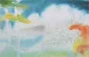
For the first wash, stains and Quinacridones provide good soft edges in the clouds, strong undercolors in the rocks, and a soft yellow green as an under-layer in the near water and soft fir needles to the left, I used Phthalo Blue, Quinacridone Violet, Perinone Orange, Cadmium Yellow Light, Green Gold in the water and Quinacridone Gold and Phthalo Green in the firs.

Here I added one wash on the trees behind the buildings and negative painted the dock, all with a dark mix of Phthalo Green and Phthalo Blue with a little Quinacridone Violet.
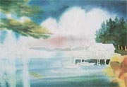
I then applied the first dry glaze to the rocks, and added a second wash on the trees using Quinacridones and sediments. Note the depth of color in the sky wash, a combination of Ultramarine Blue and Quinacridone Violet. Ultramarine and Cerulean are added to the water.
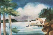
I painted the tree trunks first with Quinacridone Burnt Orange and Phthalo Blue, then brushed over with Cerulean Blue and Quinacridone Burnt Orange for texture. I fine-tuned the water with Cobalt Blue and the distant hills with Cobalt Blue and Quinacridone Rose. The nearer dark green hill started with Phthalo Blue and Green, adding Green Gold and Quinacridone Burnt Orange as it neared the bottom. Note that with the heavy working of the bottom of the fir trees on the right, there are now “wash up” scars. Also note that although quite dark, the warm glow of the stains is still visible.
Caroline Buchanan’s Staining Color Choices:
Caroline Buchanan’s Sedimentary Color Choices:
Caroline Buchanan’s Transparent (Luminous) Choices:
- Aureolin (Cobalt Yellow)
- Cobalt Blue
- Viridian
Caroline Buchanan’s Quinacridone Choices:

