Like all artists of course, I love color. I often say that I can’t even broach the doorway of an art supply store without “adult supervision” because I’ll want most every tube of paint and every brush I see! But in truth, while color in my paintings is crucial, it’s secondary in importance to value. Both of those factors must take a backseat to an overall compelling idea, story or vision. Value and color alone are ways of helping the artist to make art, but are rarely art in themselves.
 Burnt Sienna
Burnt Sienna Light
Cadmium Red Medium Hue
Cadmium Yellow Light Hue
Cobalt Blue
Cobalt Teal Blue
French Ochre
French Ultramarine
Imperial Purple
Jadeite Genuine
Lavender
Lunar Violet
Manganese Blue Hue
New Gamboge
Permanent Alizarin Crimson
Permanent Orange
Raw Umber
Serpentine Genuine
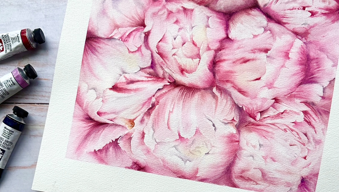
As for wanting every color on the shelf…compelling as it can seem, it just isn’t necessary. One of the qualities I love most about watercolor painting is its immediacy and the fact that so few tools are needed to create something truly good. Paper, pigment, a few brushes and of course water – and you’re good to go! But because the tools required are so few in number, the quality of those tools takes on added importance. You may not need many, but what paper, what brushes, and which pigments you choose to spend your hard-earned money on are very important.
So often in my teaching and online, I am asked a version of this question: “What blue, (or red or yellow) did you use?” It’s an understandable question, and not an invalid one, but a clear answer is almost never to be had. I rarely pre-mix colors in my palette, instead I prefer to allow them to mix themselves on the surface and within the fibers of the paper itself. So for example, the blue you might be seeing in any one of my paintings is unique and tempered with other tones its has blended with on the paper.
But probably the most characteristic quality of my painting style is my tendency to work almost solely with complementary colors, which help tell the story of light that I hope characterizes much of my work. Naturally when any two complements (any variation of the primaries – blue, yellow or red) meet, a gray or an off-tone will be created. It’s an infinite variety of unique mid-tones just wait to be discovered. But it’s the power of these grays and mid-tones, juxtaposed with the vibrancy of more pure colors, that can give a work so much life. The way blues vibrate and sing as they blend with oranges on the paper can be very potent and high key. Violets allowed to blend with various shades of yellow can transmit very different vibrations, often at a lower key. And warm earth tones made from melting reds into greens can create an infinity of lively and transparent mid-tones that never cease to amaze me.
Over time, I have tinkered a lot with my palette, trying to minimize the number of “essential” pigments and trying to find the most trustworthy and versatile colors that allow for the widest range of creative and expressive possibilities. I’ve come to prefer pigments that are a bit more sediment-based than stain-based. This is because for me, they tend to create value more convincingly and they tend to result in washes that float the pigment over the peaks in my favorite textured paper’s surface, while also allowing it to sink into the valleys. The result can often be a painting that when dry, seems more shimmering and alive than one I would do on a smoother surface. Such washes also appear to have more depth and transparency, yet have that “still wet” look that I strive to achieve .
DANIEL SMITH has made a palette of essential pigments for me – all with an eye for the complementary tones I love and with all the lightfastness, sedimentary qualities and transparency I could hope to find. As with all their pigments, these are top-shelf in quality and consistency. Their intensity and ability to blend on the paper’s surface are just amazing; they are such a joy to use. With only a few of these pigments, your painting can really begin to vibrate and resonate. In the words of the great Jeanne Dobie (my first watercolor instructor and likely the best colorist I ever met) – it really starts to sing.