Buster is a little quarter horse that I photographed at a show at the local fairgrounds. He had a string of ribbons across the front of his stall and a very long, complicated name tag that ended in “AKA Buster.” When I snapped the photo, Buster was standing in his stall, a little tired and prepping for a nap.

While the original photo captured quite a bit of Buster’s neck, I decided to crop down to get a portrait centered on his sweet face and soft eye. Instead of trying to match his color, I wanted to boost the contrast a bit and bring in shades of blue and purple that would play off of his red tones. I also wanted a painting that looked fairly detailed, but didn’t contain a lot of “fine print.”

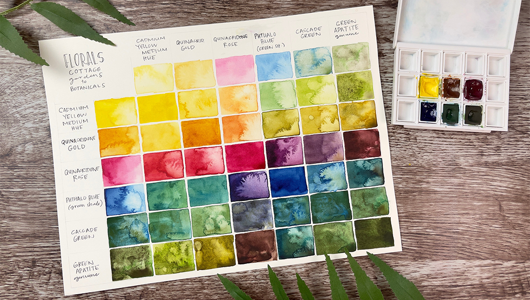
To capture the life-size portrait, I chose a half sheet (15” x 22”) of 140lb. cold press watercolor paper. My color palette was limited: French Ultramarine, Cobalt Blue, Imperial Purple, Raw Sienna, Mars Yellow and Transparent Red Oxide. There are touches of Sap Green in the background and a small amount of Cobalt Teal Blue as well.
The very first step for me in any portrait is to paint the eye(s). I feel that if the eyes aren’t right, the finished painting just won’t work, so it’s a good place to start! From there, I’ll paint out towards the ears and muzzle. Since this is such a tight crop, the typical ears/eyes/muzzle center of interest isn’t visible, so the eye really has to carry the painting.
Buster’s eyeball starts with an overall wash of Transparent Red Oxide and Mars Yellow. French Ultramarine and Imperial Purple are dropped in along the lower edge, the far left, and feathered into the lashes. The pupil is rendered as the wash is almost dry. I rarely use masking fluid; most whites are reserved, or I’ll use a white crayon to create a soft, broken line. I’m also able to lift back to white or nearly white throughout the early stages of a piece, as I try to avoid using staining pigments until the painting is almost complete. A tiny bit of Cobalt Teal is used on the right side of the white highlight to give it depth.

While the eyewash is still slightly damp, I start to indicate the upper eyelid. I want a soft transition between the two. I’ll typically work dry-into-dry and use a clean, damp brush to soften edges and “muddle” colors together. Once the eyeball is dry, the whites of the eye are added. As with humans, this is never fully white; I used a light mix of Cobalt Blue and Raw Sienna to give a soft, warm grey. The pink in the corner of the eye is Permanent Alizarin Crimson, added while the grey was still damp to soften it.

As I work out from the eye, I’ll start to build form with larger wet-into-wet washes. The lower eyelid often has a bit of a puffy look to it, so the color blends are kept soft. The veins and muscles running from the inner corner of the eye to the midpoint of the face are typically quite pronounced, so have harder edges with higher contrast. At this point, the main colors continue to be French Ultramarine, Imperial Purple, Cobalt Blue and touches of Transparent Red Oxide.
Pulling out for a broader look, you can see that I’ve started to indicate the ears and build the form of the face. Keeping in mind that the goal is to push contrasts, I’m intentionally emphasizing the shadow areas. At this stage, I’ve also started to pull in Raw Sienna and Mars Yellow for warmth. The white part of the face has very little “clean” white; most of it is a mix of Raw Sienna and Cobalt Blue. The speckled look in the background was done with a spritz of water as that section was nearly dry. I’ve also started to indicate the lower jaw, in the bottom right corner. Overall value isn’t a concern quite yet; this is still about drawing the form.
Do you notice that I’ve bent one of the rules of composition? The center of interest shouldn’t be in the literal center of the painting, yet his eye is very close to center from top-to-bottom. If you were to divide the painting into thirds vertically though, it is to the right of center. His white blaze and the dark background are strong elements on the left side of the painting, which helps balance the detailed eye. So rules can be pushed a little, if done with intention.

Let me take a moment to dispel a myth about watercolor. You’ll often hear “you can’t change anything once a wash is dry.” Well, as long as you haven’t used staining pigments, there is a lot of room for making changes! The first pass at Buster’s ear was not only looking too muddy, but also more detailed than I wanted for this piece. I brushed clear water on the area, let it sit for about two minutes, then started scrubbing with an old, semi-stiff brush. I seldom use the scrubber style of brushes as they can damage the paper.

As the paper started to dry, I dropped in fairly saturated color – French Ultramarine, Imperial Purple, Transparent Red Oxide and a touch of Mars Yellow. A light spritz of water and some tilting back and forth got the colors moving and blending a bit. The hair at the bottom of the ear was indicated with a damp ¼” flat brush, lifting out the darker wash.
Now we’re in what I call the “trainwreck” stage. The main elements are in place, but the different areas don’t blend together, and the value map is all over the place. As you can see by comparing the reference photo, some areas need to be lighter, some darker, and the warm chestnut color will need to be more prominent to balance the coolness of the dark tones. This can be a very frustrating stage, and a lot of paintings get abandoned at this point.

If you’ve done value studies or have written down your goal for the painting, it can help keep you focused when the doubts start creeping in.
I also want to comment on my reference photo. Sometimes I work from 4” x 6” photos, and other times I’ll blow up a photo to closely match the painting size. In this case, having the photo very large helps me see the different planes in his face. I’m not trying to match exactly – you can see that I gave his eye more energy – but I’m still concerned with the accuracy of his underlying structure.
At this point, I’ve laid in quite a few dark washes along the right side of the face, blending the cheek into the lower jaw.

To create these soft blends, I’ll wait until a wash is almost dry, then come in with a slightly damp 1” flat brush and drag through the wash. This creates some directionality, which enhances the form and suggests the hide.
The speckled background seemed too pronounced, so I’ve started washing over it with light layers of French Ultramarine and Transparent Red Oxide. There is also some Sap Green to indicate the outdoors, instead of the flat grey of the stall from the reference.
Final touches include lifting out a couple of long whiskers above the eye, and lifting a soft light blue edge along the top of the lower eyelid. I spritzed a bit of water on the upper left corner, and drug a barely damp brush through it for texture. The hints of lighter color give the impression of leaves. I did one final comparison to the reference to make sure the underlying structure of the face was correct. You can take a lot of liberty with color, value and texture in a painting, but if you’re going for a representational portrait, it has to look like the subject!