When beginning a landscape painting, my first concern is about shapes and composition. Are the shapes good enough and the composition interesting enough for a successful painting? If so, my next thought is about mood. I rarely ever paint a scene exactly as it is presented to me, whether painting in plein air or from a photograph. Unless I’m really fortunate to stumble across a fantastic scene, I will almost always want to change something when it comes to mood or atmosphere. I actually find it enjoyable to experiment with mood and color choices, trying different effects with the same scene. If I have shapes that would make interesting shadows, I’ll definitely try the scene with a sunny day to exploit the shapes.

Before I begin, I must decide what I want to express in the painting. Do I envision the scene as bright and lively or would it be more expressive as muted and somber? This is where color choices come in.
Above are studio paintings from a photograph. Looking at the two examples, one might surmise that the paintings were created with two very different color palettes—one with bright warm colors, the other with grays and muted colors. In fact, these paintings were completed with the same colors of paint with one difference. In the painting on the right, I added a bit of Neutral Tint to every color.
Featured Colors:
- Quinacridone Gold
- Quinacridone Sienna
- Quinacridone Purple
- Permanent Brown
- Permanent Alizarin Crimson
- French Ultramarine
- Cobalt Blue
- Neutral Tint
Color & Mood
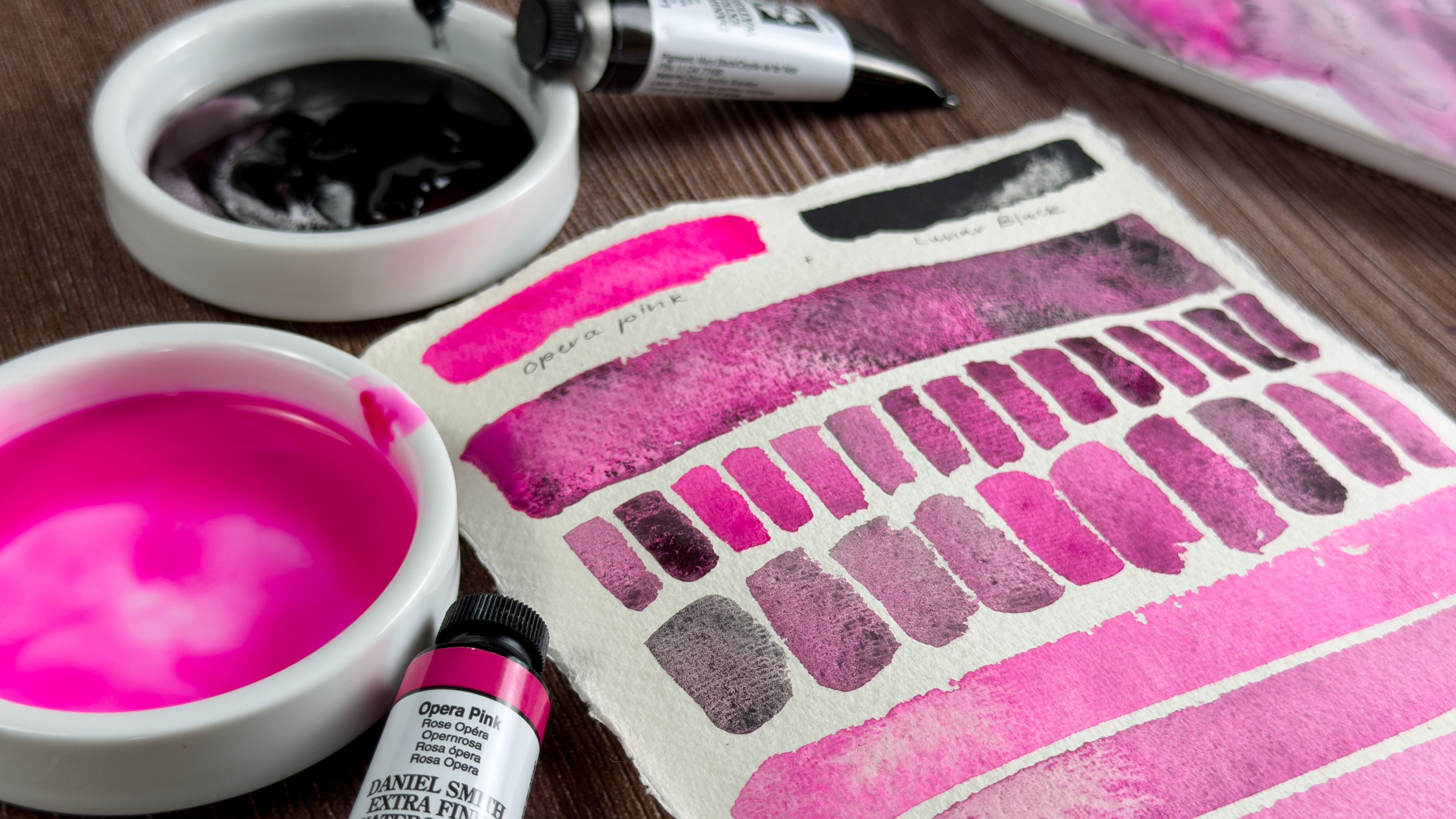
In the top painting, in all areas touched by the sun, Quinacridone Gold is either used in the blending of paints, or I’ve added a thin glaze of it to an existing color to warm it. Even the white of the house has a very thin glaze of Quinacridone Gold. It is a versatile color that mixes well with other colors; I use it a lot. It is ideal for warm, sunny days. DANIEL SMITH’s complete line of Quinacridone colors are beautifully transparent with clarity and brilliance of color, which is why I’ve chosen three of them for these paintings.
In the second painting, I used the same colors as I used in the first, but with less Quinacridone Gold (I still used some to mix my greens), and I added a touch of Neutral Tint to all of the colors. With an overcast or gray day, color is muted but you can still distinguish hue. It has color, but it is neutralized. I know I could have muted or grayed the colors individually by using their complements, but using Neutral Tint throughout gives the painting a sense of unity. I enjoy using Neutral Tint for overcast, rainy or foggy days. It can be warmed or cooled with other colors as needed in a painting.
Here are photos of the paintings with their first washes. You can see the mood is set with the very first sky wash, Cobalt Blue and Quinacridone Gold in Painting #1 and Cobalt Blue with Neutral Tint in Painting #2.

In developing your palette, bright colors are always a good choice. It is impossible to fully brighten a dull or muted color, but you can always mute a bright color, either with its complement or Neutral Tint. That is why I am such a fan of DANIEL SMITH paints in general, and especially their Quinacridone line. Their clarity and brilliance of color are unequaled and I can use them in almost every painting.